Posts

Image
Friend in a bottle process Throughout the project The process of going through the commercial, then the animation, and lastly the logo was kind of abnormal. During the process of making the video we had to story board and go through each shot to make sure they all fit together. We had to make sure that it looked like a video that would be appropriate for a commercial. For the process of the animation our team split the jobs up. we each had one job to complete, either packaging, lettering, making the 3D bottle, or making the setting. We all combined it into one to have complete animation. For the process of making the logo we had to First decide between 2 designs. Once we decided we split that between two of our team members to both create 2 of the sane ones to be able to compare and see which one we liked better. While we were doing that, the other two members were helping design the website and what to say throughout it. along the way i learned how to work with all d...
Image
Our commercial was really focused on the happiness our product would bring to people who aren't generally happy. We had a relatable situation tie into our product and the use of it. Since not everyone has friends our product offers friends from all over. By watching our video it makes kids have something to look forward to when they pull out their friends in a bottle. Our team wanted to focus on making the commercial a relatable experience for the kids or parents who may be watching. We made sure to show a lot of emotion throughout the video to help the viewer compare how he was feeling before he got the friends in a bottle to after he got friends in a bottle. Within our video we had 2 testimonies that helped show the comparison between before and after as well as tell the viewer how the bottle will make them happy with the friends.
Image
 Project 1 This project focused on how to deal with layering and specific opacity for each picture. We had to learn how to layer photos and make them look reasonable with the opacity as well. We also were introduced to many of the edits that you could apply to any of the pictures. This project was slightly challenging because of having to resize the images. Once i figured out how to correctly resize the image and layer multiple pictures, it wasn't as challenging. Learning to use the tools was a quick process for me because most of the tools were very necessary. Project 2 In the monarch project we learned how to use the clone brush and how to make the butterfly look like it was flying or 3D. Learning this tool was helpful for project 4 as well because we had to erase a few things in the picture and make them look like they were gone. working with the butterfly we also learned how to highlight specific areas of an image and change the color. Originally the butterf...
Image
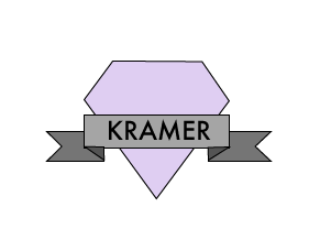
               My logo is a diamond with a banner over it. I chose to use a diamond and a banner to show sophistication and make it look modern. I used all sharp lines and shapes that helped showed the sophistication.  For my colors I chose to do an accented neutral color scheme just to make the accent really show a lot. The gray against the purple makes the purple l the point of emphasis.  For my fonts I wanted something with sharp edges to keep it throughout the whole  theme.  I liked this font because it seemed modern and up to date.
Image
Over the color assignments i had a review of the color schemes and color psychology from my design class earlier this year. I did not know about the double split complimentary. I learned other ideas about how to use them in graphic design versus using them in fashion or interiors design as i had before.  
Image
Throughout this quarter in video, i have learned a lot. It was a good experience to be able to learn about video tips and the six shots. Coming into this class i knew nothing about video or any sort of sequencing with the six shots. I enjoyed being able to work in groups because it was good being able to share ideas throughout the group. We all got to share our own creativity with a piece of each video. I will probably continue to learn about ecomm and the video strand more particularly. Most of the  quarter was really fun. We definitely had to put a lot go thought into making each video perfect and making sure the shots all transitioned well. I think that working with groups was the most fun part because being able to share our ideas was best for making the video be the best it could be.
Image
 This project did not interest me at all. I didn't understand why we were doing these specific steps and why it took such a long process. There is a 0% chance that i will be a web designer because i do not have the patience or control to be able to ever do that again. I did not think this project was fun because of all the confusion. I think this project was not the best for me. I can not even imagine having to do this for a career because i would probably just lose it. I don't think a job where you're always on the computer is best for me.