Posts

Showing posts from 2015
Image
On top i have my business card that i made off of an inspiration off of moo.com. I wanted my company to give off a sense of unity and organization which is why i made the colors neutral. I used a font that was very modern and stylish along with the black and white simplicity of it. On the bottom i created a GIF by using the paintbrush tool in illustrator and exporting it in a stack of pictures to photoshop and putting it in the timeline. After that I put a layer of text over it and saved for web as a GIF.
Image
SEMESTER REVIEW                This semester was focused on convergence journalism and things like interviews and real life stories and news packages. he projects that were assigned were based off of learning how to develop a set of questions, frame an interview, get b-roll, and utilize all the skills such as the audio levels, the nat nose, and the J and L edits while editing the entire piece. projects like the summer interview were focused on mainly audio versus projects like the hobby one where that was focused on putting all the skills we learned together. Some key events i learned along the way was how much outside work the class requires in order to have your best final product. For the hobby project I was partnered up with courtney which had performing arts/ acting as her hobby. In order to film a good interview story on her role as a performer, i had to stay after and go to rehearsals with them and get really creative shots since i wasnt able to be up close and personal at a l
Image
Image
This is my tile that hasn't been printed. I learned how to make a pattern and i have yet to learn how to center it without moving the artboard.
Image
Image
Painting project- For the painting in photoshop, i used my own picture and used the mixed brush tool. This picture was taken in Burano, Italy that focuses on the bright colors throughout the buildings, and the alleys of water. By painting it with the mixed brush tool, i tried to incorporate only the main things about the city. I figured most of what was important was just the big pieces. Things like tiny plants didn't need to be pictured, i thought, because they aren't crucial to the scene. 
Image
I decides to recreate the Tory Burch logo. I used many different layers to create the unique shape. I also used the ruler tools to make sure that it was all lined up. Recreating the logo, i had to be aware of size and color to make sure the proportions looked correct.
Evan good things: Great J and L cuts with good timing constructive: adjust audio levels during voice over so it has more of a transition Nick good things: good video timing and equal amounts of J and L cuts! constructive: adjust levels on voice overs because they were too quiet. Allison good things: good wording on voice overs and good broll constructive: extend audio a little more so it doesn't seem as chopped up. Court:  good things: good story line and good job getting enough information from one guy! constructive: adjust Nat noise a little bit lower. Dema good things: Great broll and interviews!  constructive: your voice overs seem a bit long! maybe shorten them to something more of a description. Rosie  good things: good job telling the story well!  constructive: I would consider finding some more still shots so the camera isn't moving.  Kiki good things: good interviews! constructive: I think there's a lot of
Professional article review Creative Anarchy at Its Very Best Creative anarchy is about using the rules as guidelines and using your imagination to make up for the rest. This article is reassurance that it is okay to color outside of the lines in graphic design (not literally). Taking risks is what graphic design is all about. When it comes to completing the client’s needs, you have to meet them halfway. Finding that happy spot where both the clients ideas and the designers creativity meet is what makes a good design.   The author of this story is trying to get the fact across that not all designs must be so limited. As a designer, you have to be okay with the concept of your mind to new ideas and creative details will open up a whole new world for your graphic design.   For example, the author say’s “Design rules are more like guidelines.”   This quote shows us that the author literally means that rules aren’t always followed in graphic design and its not always necessary.
Image
Image
This is like the close up of the pattern because i didnt make a full thing so just imagine it being like repeated (: 
Image
"I'm Good" by the Mowgli's is a video about overcoming things and looking at the upside! The Mowgli's are all about positivity and they incorporate this well with their video full of colors and upbeat scenes. The shots are filmed without a clear story, other than them just having fun and enjoying everything. The camera was used in all different angles to capture the effect that they were different from other ordinary videos with a basic scene. They also used multiple effects in the background as well as exotic colors i think to give off a feel of bright and energetic moods. An element i would like to apply to my own work would be the moving camera and unique shots. I think that created a sense of mystery between the viewer and the video. An element that i've learned was the ordinary close up and medium shots they used quite often throughout the video. The camera man did well with capturing the whole scene and showing us the whole group, but the could impro
Image
The pencil too the right was the starting pencil. The same form of pencil changes in color in the picture to the right. The pink mechanical between the backpack and can is what i made from scratch using my knowledge from making the basic pencil. In addition to the pencil i made the pencil can which demonstrates how to use a pattern and a gradient color. I also made a backpack to go with the school scene. The backpack was made with a ton of shapes layered to look like a complete shape. I took the Jansport backpack logo and put it on to make it look more like a backpack. I also made a zipper on the front of the backpack to show that there was a pouch there. With my backpack i made sure to use accent colors of the pencil can and mechanical pencil in order for it to look more appealing.
Image
Friend in a bottle process Throughout the project The process of going through the commercial, then the animation, and lastly the logo was kind of abnormal. During the process of making the video we had to story board and go through each shot to make sure they all fit together. We had to make sure that it looked like a video that would be appropriate for a commercial. For the process of the animation our team split the jobs up. we each had one job to complete, either packaging, lettering, making the 3D bottle, or making the setting. We all combined it into one to have complete animation. For the process of making the logo we had to First decide between 2 designs. Once we decided we split that between two of our team members to both create 2 of the sane ones to be able to compare and see which one we liked better. While we were doing that, the other two members were helping design the website and what to say throughout it. along the way i learned how to work with all diffe
Image
Our commercial was really focused on the happiness our product would bring to people who aren't generally happy. We had a relatable situation tie into our product and the use of it. Since not everyone has friends our product offers friends from all over. By watching our video it makes kids have something to look forward to when they pull out their friends in a bottle. Our team wanted to focus on making the commercial a relatable experience for the kids or parents who may be watching. We made sure to show a lot of emotion throughout the video to help the viewer compare how he was feeling before he got the friends in a bottle to after he got friends in a bottle. Within our video we had 2 testimonies that helped show the comparison between before and after as well as tell the viewer how the bottle will make them happy with the friends.
Image
 Project 1 This project focused on how to deal with layering and specific opacity for each picture. We had to learn how to layer photos and make them look reasonable with the opacity as well. We also were introduced to many of the edits that you could apply to any of the pictures. This project was slightly challenging because of having to resize the images. Once i figured out how to correctly resize the image and layer multiple pictures, it wasn't as challenging. Learning to use the tools was a quick process for me because most of the tools were very necessary. Project 2 In the monarch project we learned how to use the clone brush and how to make the butterfly look like it was flying or 3D. Learning this tool was helpful for project 4 as well because we had to erase a few things in the picture and make them look like they were gone. working with the butterfly we also learned how to highlight specific areas of an image and change the color. Originally the butterfly was ora
Image
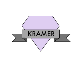
               My logo is a diamond with a banner over it. I chose to use a diamond and a banner to show sophistication and make it look modern. I used all sharp lines and shapes that helped showed the sophistication.  For my colors I chose to do an accented neutral color scheme just to make the accent really show a lot. The gray against the purple makes the purple l the point of emphasis.  For my fonts I wanted something with sharp edges to keep it throughout the whole  theme.  I liked this font because it seemed modern and up to date.